Pencil, ink or storybook: choose an animation style
Style changes how a small movement feels. Pencil can make a quiet gesture feel intimate; ink can emphasize a silhouette; storybook color can help a character stand out. HandDrawnAI offers these three style settings. Start by choosing the mood you need, then write the action.
Pencil for quiet observations
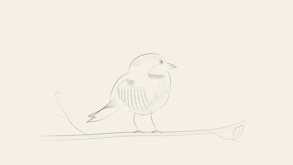
Try pencil for a bird turning its head, a leaf drifting down or a person pausing to think. Ask for visible sketch lines, a light paper background and a clear subject. Keep the background restrained so small changes in pose remain readable. Pencil is a visual style here; the output is generated animation, not footage of an artist drawing.
Ink for clear shapes and contrast
Ink suits bold silhouettes and a limited visual vocabulary: a cup, a plant, a paper boat. Describe line weight and the areas that should stay empty. If the scene becomes visually busy, remove decorative marks rather than adding more descriptive adjectives. A strong outline can help a simple action read at a small display size.
Storybook for color and atmosphere
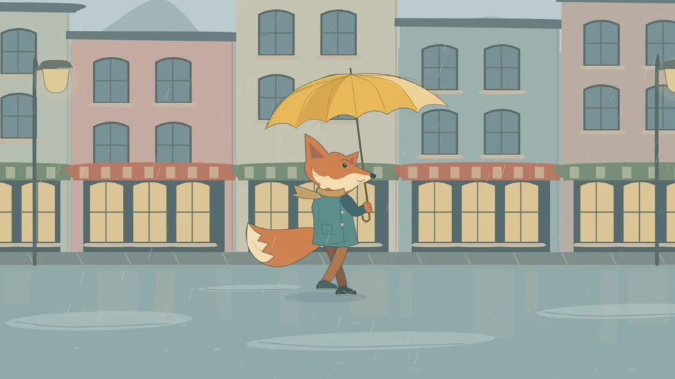
Use storybook when color helps explain the subject or the mood. Give the main character one dominant color and let the background stay quieter. A yellow raincoat against a muted town is easier to describe than a scene in which every object needs a different bright color. Colorful does not have to mean crowded.
Compare styles with the same action
Keep the character, action, duration and aspect ratio unchanged when comparing styles. Change the style setting and the matching visual phrase in your prompt. Watch for subject clarity, readable movement and a useful composition. Generated results vary; do not assume a style selection guarantees the same character design across separate clips.
Use the gallery to explore the visual direction, then test your own subject. Gallery clips illustrate the look of the product; they do not guarantee an identical composition or movement from a new generation.